- Client
- Northline Public Radio
- Year
- 2024
- Discipline
- Interface & Motion
A motion identity for a radio network — which is to say, a visual system for an organisation whose actual output nobody looks at.
Northline reaches most of its audience through car speakers and podcast apps, so its visual identity does a strange job: it appears on a phone lock screen for two seconds, on an event banner in a community hall, and in a two-second sting before a news bulletin. Nothing about that brief rewards a beautiful static logo.
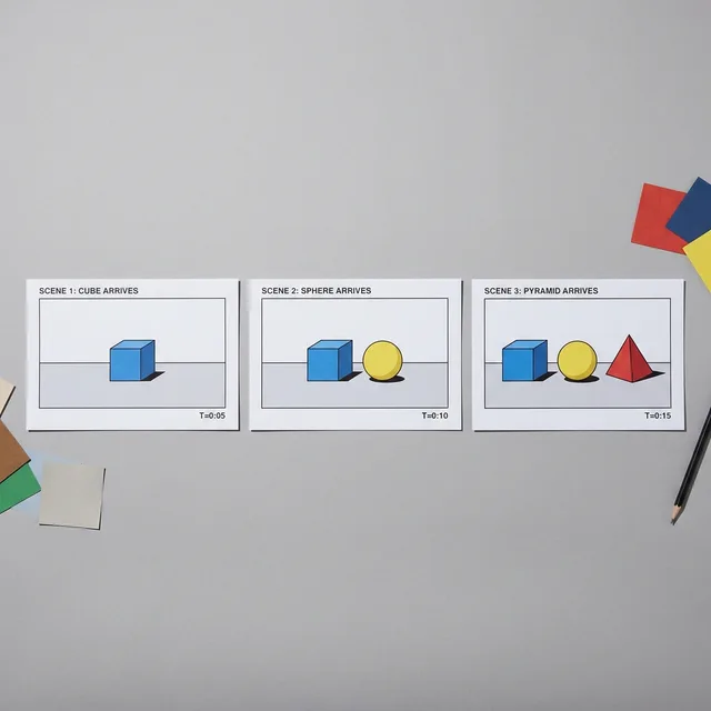
We designed the sting first and derived everything else from it. The network's audio identity already existed and was genuinely good — three notes, thirty years old, universally recognised in the region — so the visual mark is a direct transcription of it: three elements arriving on the three beats, in the same intervals. Once that existed, the static mark was simply a frame of the motion, chosen rather than designed.
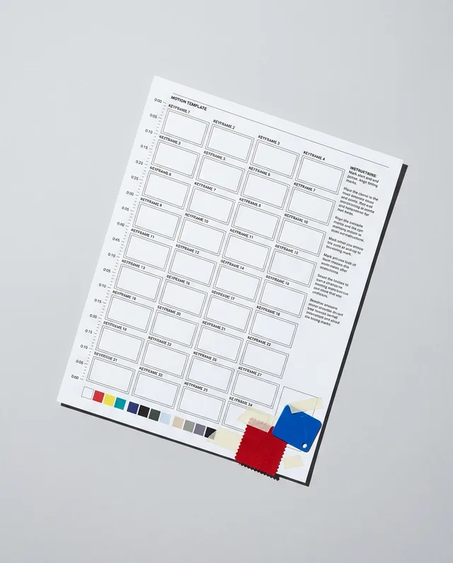
From there the system is a set of behaviours rather than a set of assets. The three elements can carry a programme name, a frequency, a live indicator or nothing at all. On a lock screen they hold still. On a banner they are printed. In the sting they move. Producers were given the motion as templates in the software they already use, because a motion identity that requires a designer is a motion identity that will be screenshotted and stretched.
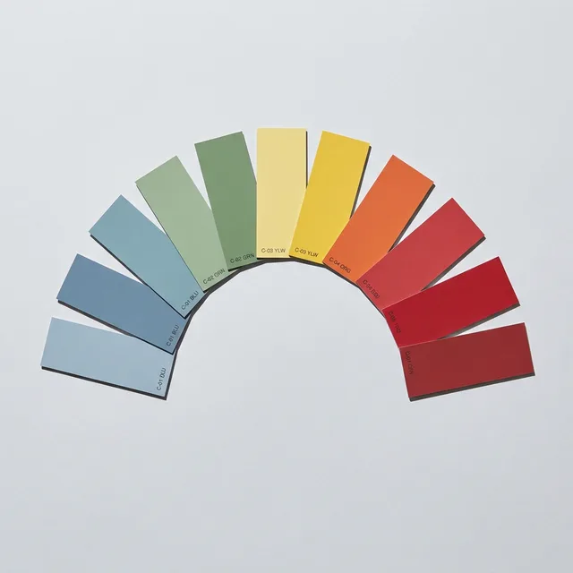
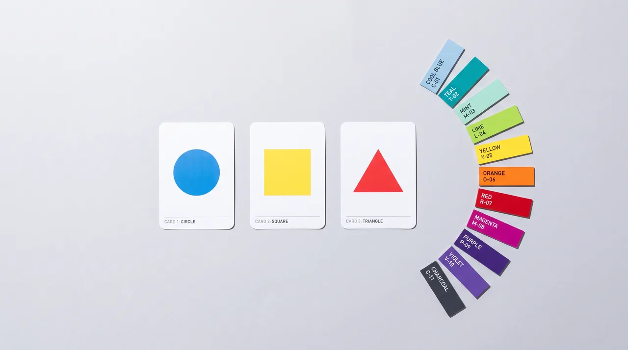
The one thing we argued hardest for was restraint at the station level: eleven local stations had accumulated eleven visual dialects, and consolidating them was politically expensive. What made it possible was giving each station a colour rather than a logo — a single durable distinction that satisfied the local attachment without fragmenting the network.